As part of the Spend Experience team, we looked at reducing costs across the entire transaction lifecycle.
Reducing confusion on card refunds
Responsibilities
- User interviews
- UX/UI design
- Component breakdown
Tools
- Figma
- UserTesting.com
- Looker
Credits
- Karam Kanan for Product Management
- Triinu Palmre for Data Analyst
Background
Wise (formerly TransferWise) started its journey as a GBP-EUR money sending product. And while that still is at its core, the central part of the business, it's grown past every money-managing feature imaginable.
With a flat structure, Wise's mission is the driver on every decision:
Money without borders - instant, convenient, transparent and eventually free.
The company divides into 4 main features and respective teams (among many others): Send, Receive, Spend, Save which respectively handle transfers out, in, card experience and saving accounts. I was the main designer on the Spend team, working across Personal and Business.
Understanding the problem
When I joined, Spend Team had been without a designer for 6 months, and needed someone to act on things quickly. Together with the PM, we decided to look into reducing costs.
The highest cost on Spend was a customer support due to confusing refunds. We decided to do a 2-week discovery exercise, together with support team, reading through emails and interviewing customers to decide on scope.
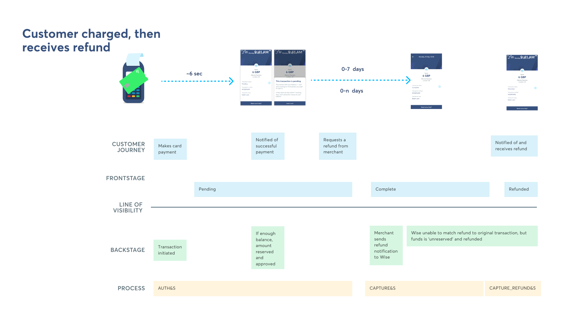
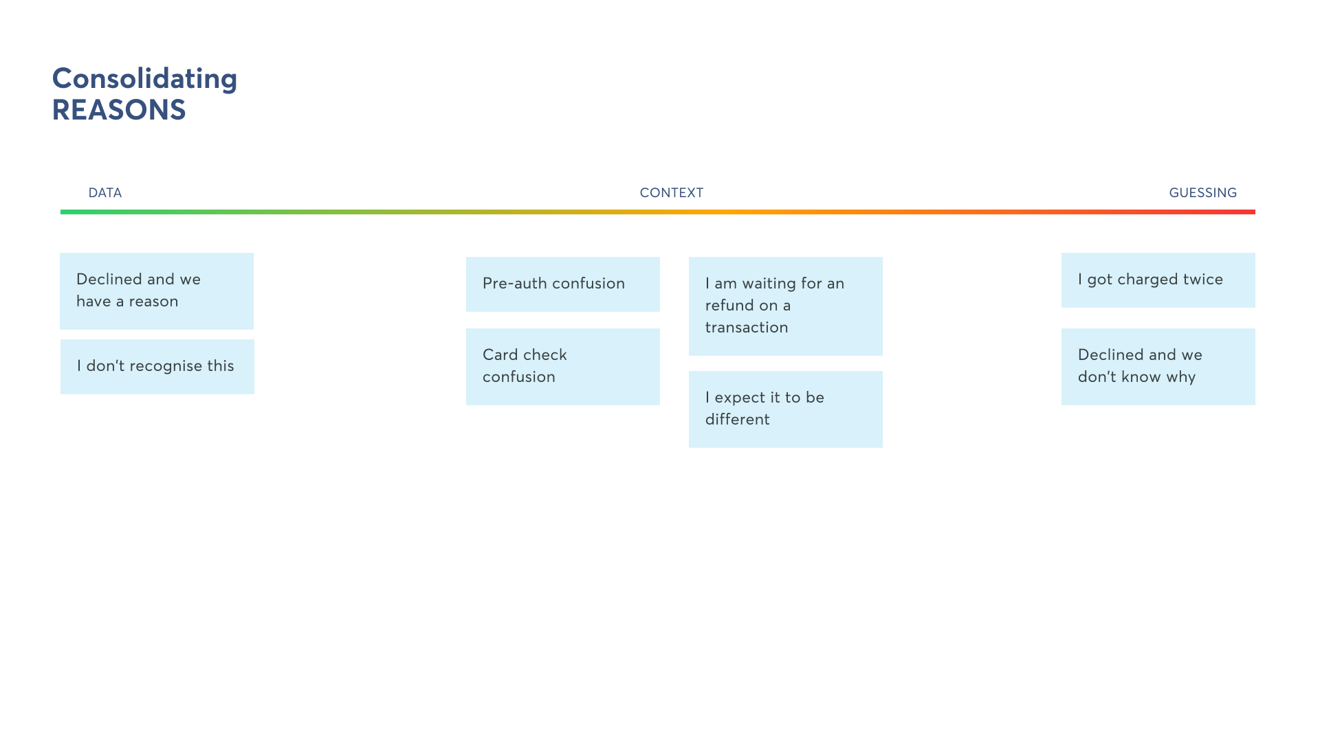
Out of 28,000 transactions analysed and 20 customer interviews, we identified:
- 16 types of refund cases, most confusing one being pending
- 0-7 days is the average time between pending and receiving refund
Most importantly, 50% of customers expected their transaction to update on refund, but the current experience was a separate transaction.
Mission and solutions
We set the goal to reduce CS rate by 30% overall, with a focus on pending transactions — but we took this opportunity to go broader and solve problems across the whole lifecycle.
Each of this features was tested live, independently through A/B testing in-product, before being added to the main scope. Grouped by impact:
- Identify transaction: Added merchant icon, clean merchant name, conversion breakdown
- Identify state: Split refund and cancelled types, pending active state gives more information
- Remove clutter: Duplicated values, deprioritised transaction ID, unified location
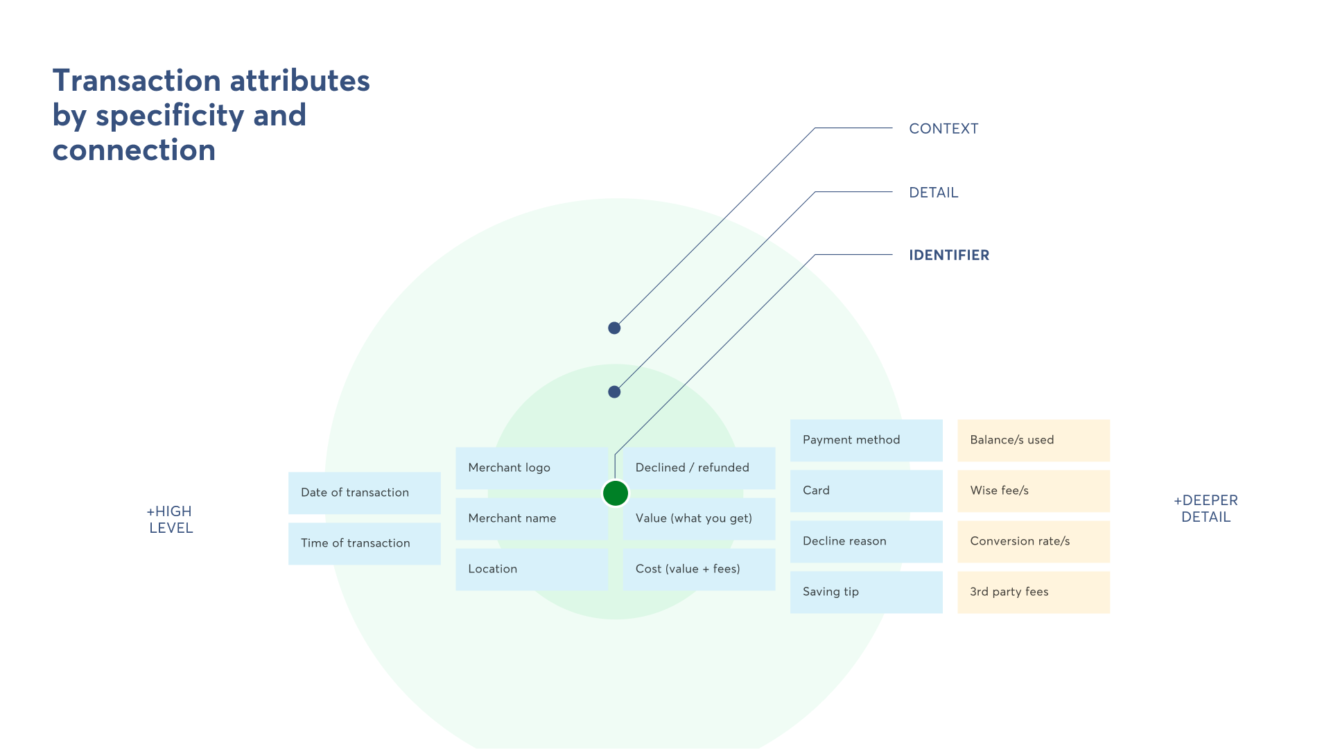
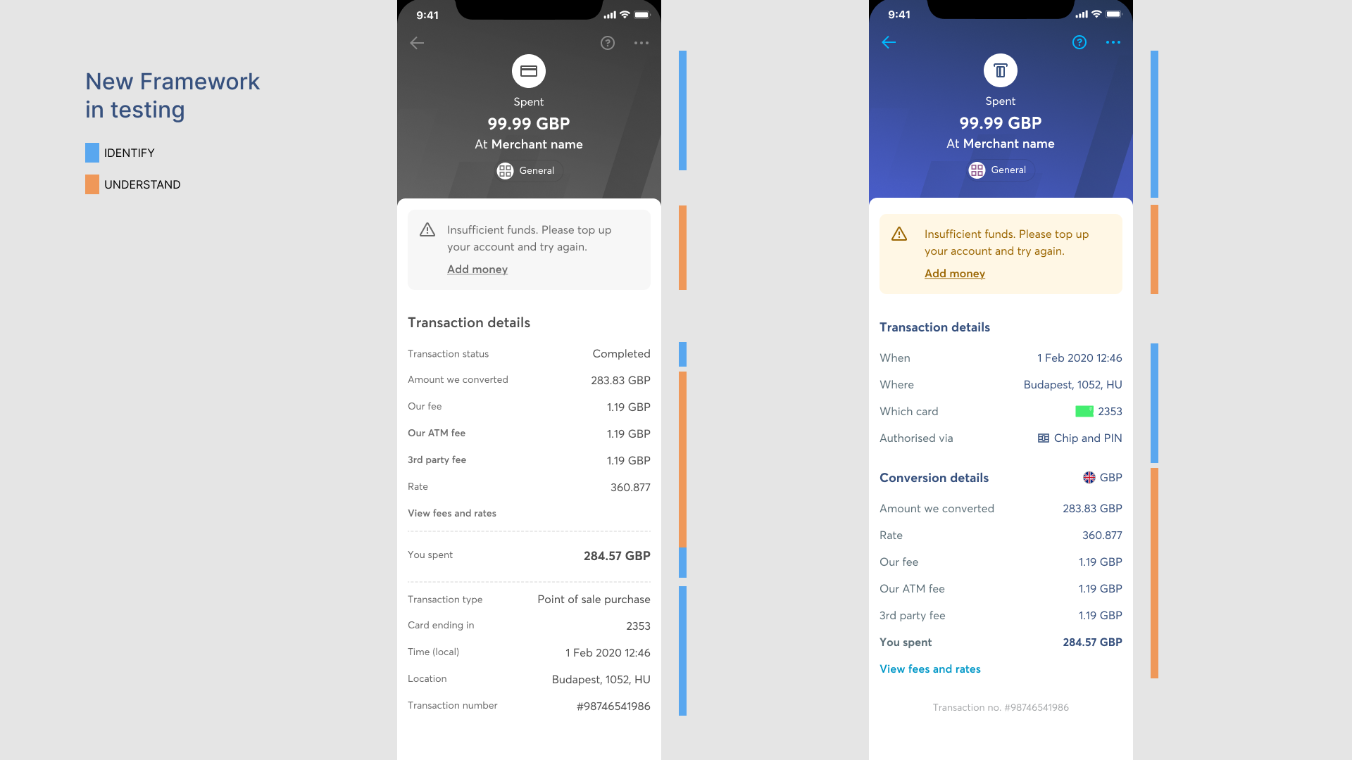
To cover all scenarios, we had to simplify and extend the current transaction framework. The focus was on identifying the transaction and its state.
Final design
We rolled out the final changes in two stages. First focused on states, increasing consistency across them and second added conversion breakdown, making it consistent with Send transactions.
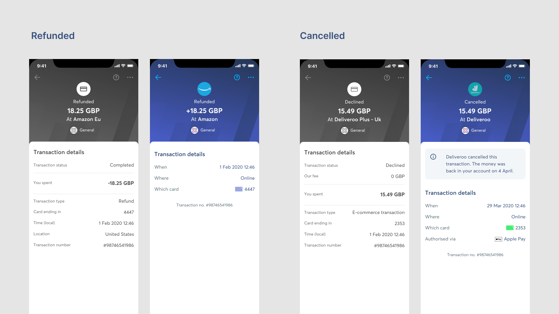
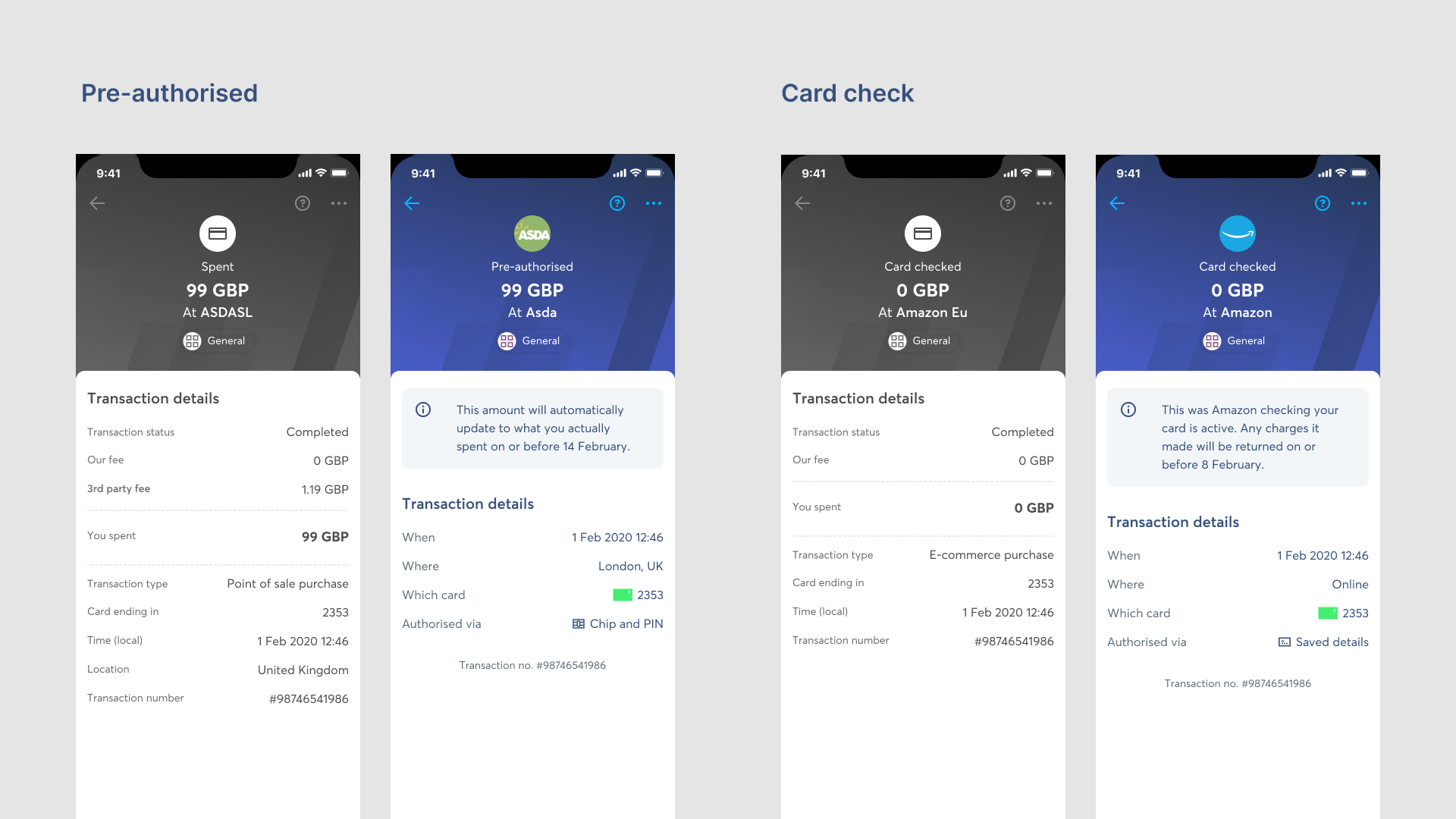
The full breakdown (contact me to see it!) includes 8 transaction types, of which 4 refunds (shown here) plus 8 transaction types, 10 payment methods and 3 types of conversion (none, one to one, many to one).
What drove the best results were changes on those previously treated as pending, as well as smaller cases like card checks or pre-authorisations.
- Addition of plus sign (+) on refunds made them stand out, easily identifiable.
- Declined transactions (charges turned into null) now treated as cancellations plus explanation.
- Pre-authorised and card check now clear and explained thanks to the gained space.
Results and improvements
With these changes, we managed to achieve a reduction of 32% of CS over the following quarter, with the type clarity being the most impactful change.
Things I don't like or I would do differently:
- Conversion details is too much detail, but we were limited by the Send framework. I would love to explore showing a single fee and explaining it, rather than multiple fees.
- The right aligned attributes is are hard to read, would love to see what left aligned results drive back.