Background
Moteefe allows creators to upload an artwork and start selling branded garments with no up-front cost and before the product even exists physically. That means it's a double product, a a B2B app for admins or creators to manage their products, handle payouts, etc and a B2C when these products are presented to customers.
The company was born in 2014 and had been building upon their original branding and UI ever since. In 2016, they decided it was time for a rebrand and cleanup.
Understanding the problem
BEAR agency was commissioned with the rebrand, and I was taken in as the frontend architect to lead and execute this new branding into their current UI. Shortly after joining, I discovered:
- BEAR was commissioned with discovery and branding, but not UI design
- BEAR's efforts for branding were great for marketing purposes, but didn't do enough for product design
- BEAR's brand suggestion was strikingly different, which helped make the product stand out. But testing revealed creators wanted the b2c side of things to be as white label as possible, so it couldn't apply there, or as much.
- With years of UX debt and no head of design in charge, Moteefe's platform was in need of a massive UX redesign, not just a brand refresh.
- As a small startup quickly grown into a massive company, there was a massive lack of processes in place.
Mission and solutions
After a few brainstorming sessions with the London and Lisbon offices, I quickly identified Moteefe's mission:
Empower creators to deliver branded garments and test niche audiences with no up-front cost
Thankfully BEAR had already done the work on the company values:
![BEAR company values]()
At a brainstorming session with the founders, this seemed to be the crazy user flow:
![Moteefe user flow]()
After a few days of strategic discussions and product research, it was decided we should rebuild the app from scratch, in stages and in React.
Solutions:
- Workflow: there was no working methodology set in place, only the developers had their tasks broken into bits. I proposed educating the team in SCRUM.
- Team up: as the task at hand was much greater than I originally anticipated, we specced out the need for a UI designer and a few React developers.
- Project planning: this was a humongous task, so we broke it down by projects.
- Content analysis: Analyse the creator's needs and goals and rework the information architecture.
- Homepage: the landing page for creators.
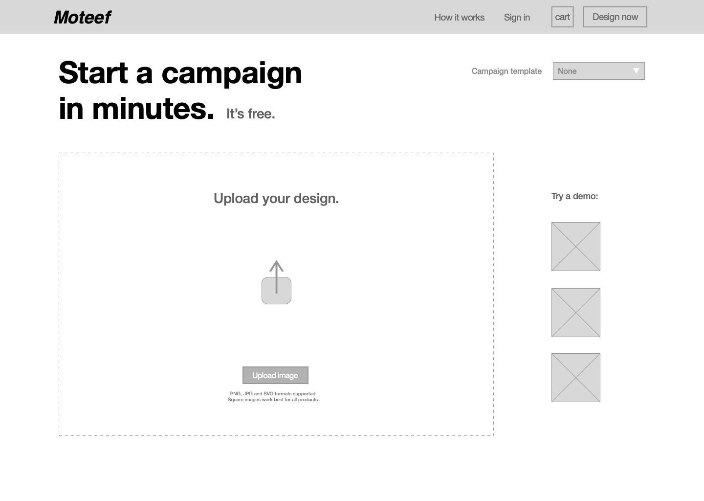
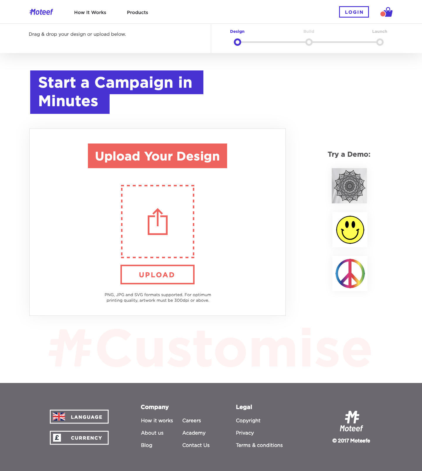
- Campaign builder: the tool creators would use to upload artworks, customise their products and set their campaigns.
- CRUD app: The dashboard side of things, where creators manage their campaigns, payments, etc.
- Campaign page: The customer-facing side of a campaign.
- Checkout: Including upsell, CR analysis, etc.
- Stores: Campaigns may group into branded marketplaces that we called stores.
Implementing SCRUM
![Implementing agile]()
Some of the team members had worked with agile methodology before, but the founders had been working on different ways as the company grew and hadn't considered ownership as part of project planning. Epics was a completely new concept for them. So I sat down with them and after a few sessions, we had set a few guidelines:
- Milestones would be owned and set by the founders, reviewed on a monthly basis and represent company goals.
- Epics would be owned by founders or managers, reviewed on bi-weekly sprints and represent projects that could be one to many sprints long.
- Tasks would be owned by anyone, usually assigned to one single individual and reviewed daily (if in progress) or weekly (if in icebox).
We tried many tools like Asana and Jira, but finally decided on Zube for its integration with GitHub Issues, which was powerful for us given the distributed teams across London, Lisbon and Moscow, plus remote workers like myself.
Redesigning the campaign builder
The creators had a campaign builder tool at their disposal to create the garments and set up their campaigns. One of the biggest challenges of the experience was making it both easy to use and communicative of the marketing options available to creators.
The company's directions on how to inform things like VAT, product availability and cost weren't clear, so there were some heavy brainstorming sessions until late.