CASE STUDY: Helping people choose coffee with more of the story
Freelance, London / Remote
Dec 2023 – present

Helping people choose coffee with more of the story

Show me the work ↓

The short version

  • Role: Design and Shopify implementation with the Glass team, including reusable sections and flavour components.
  • Problem: Choosing a specialty coffee means understanding flavour and brew options without losing its producer, origin and processing story.
  • Decision: Use one flavour component for filter and espresso, with separate product data for each brew method.
  • Result: A working storefront with repeatable product structures, provenance and flavour components.

Enough to choose. More to discover.

Producer, variety, processing, origin and flavour become useful buying information, rather than a separate story people have to hunt for.
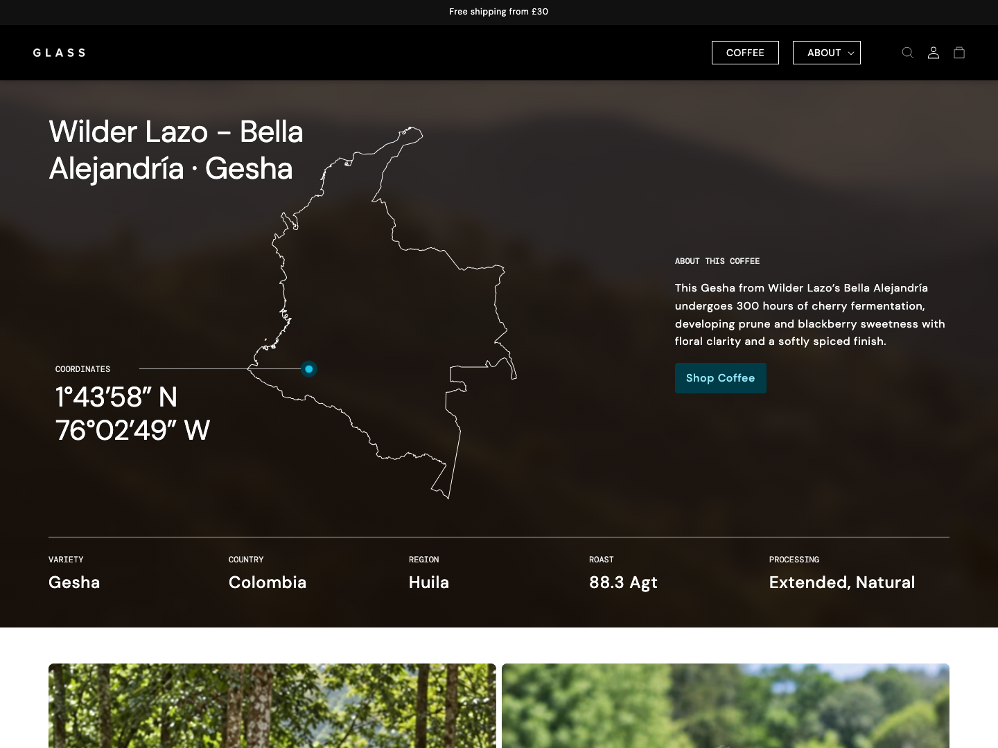
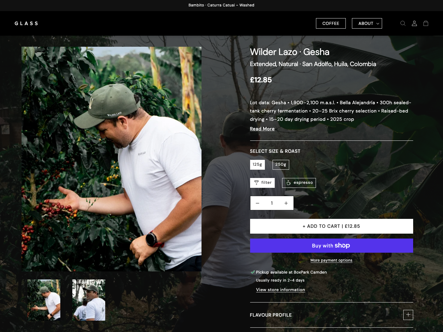
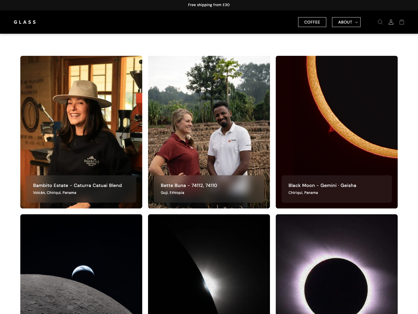
Public Glass Coffee storefront showing coffee provenance, an origin map and key product characteristics

The shopper’s route

Choose a coffee with enough of the story.

The public storefront.

  1. Browse

    What should I explore?

    Repeatable product cards make the range easier to scan.

    View the evidence
  2. Explore flavour

    What might this cup be like?

    One component presents each coffee’s brew-specific profile.

    View the evidence
  3. Know the origin

    Where does it come from?

    Keep producer, origin and processing beside the buying information.

    View the evidence
  4. Choose a format

    Which brew and bag size?

    Bring the options together on the product page.

    View the evidence

Tiny big detail

An icon and a word.

Each brew icon has a label, so choosing filter or espresso doesn’t depend on recognising the symbol.

Brew choices on the public product page.View full screen
Brew choices on the public product page.

01 / Product experience

Enough to choose. More to discover.

A repeatable structure across coffees

I built reusable Shopify sections around product metafields. Filter and espresso have different flavour data, but share one component. That keeps the interface consistent without flattening the differences between coffees.

Public Glass Coffee collection page showing the coffee range and product selection

Product detail, without losing the story

Brew method and size sit alongside origin, process and producer information. The same page lets someone choose a coffee and discover where it came from.

Public Glass coffee product page showing filter and espresso options, size selection, origin, processing and producer information

02 / Beyond the storefront

The coffee. The people. The story behind it.

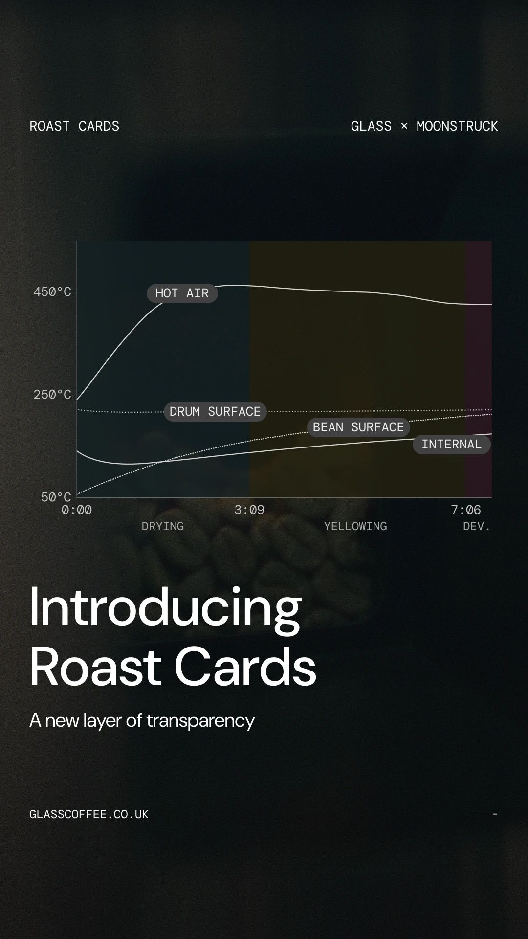
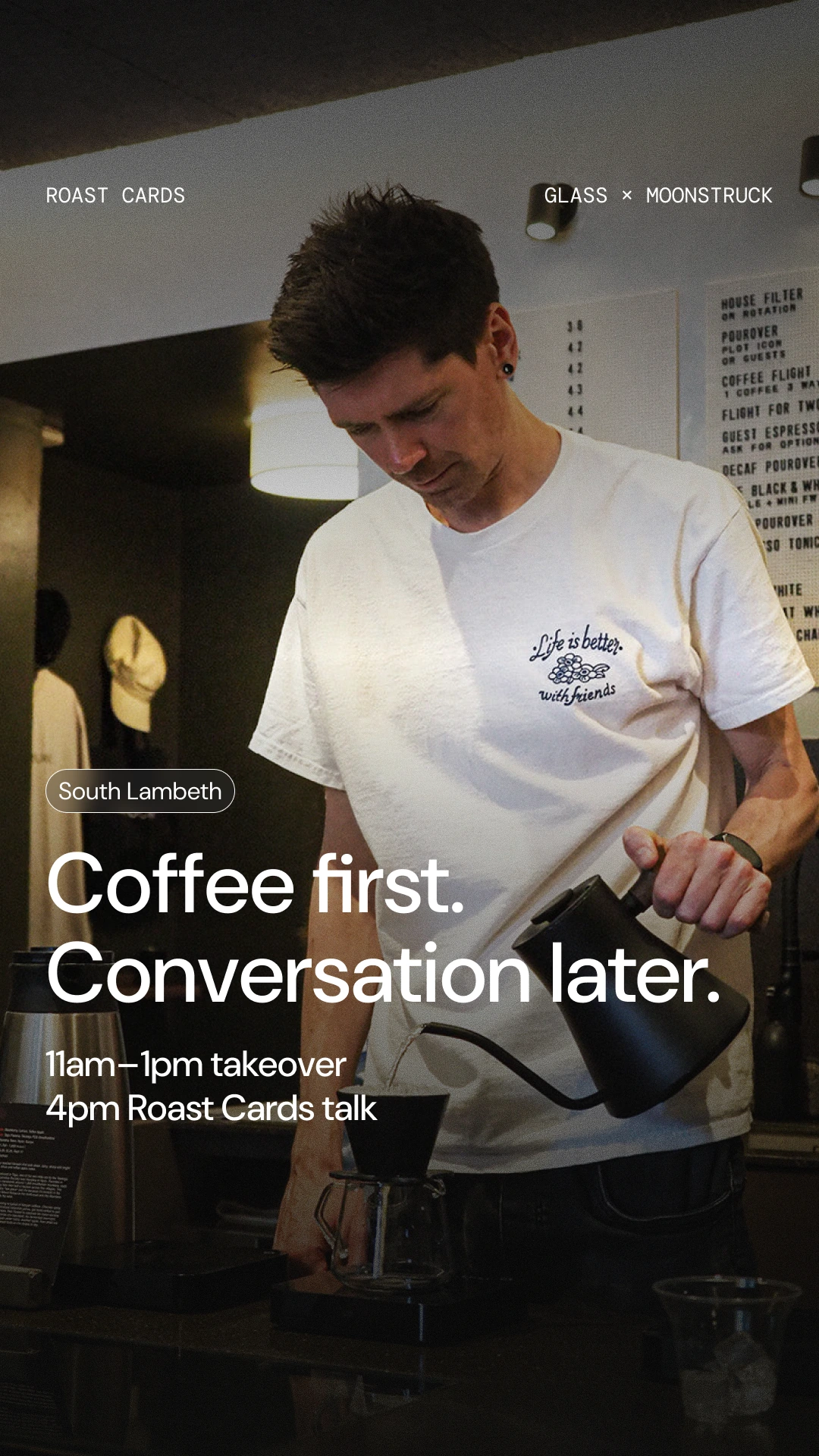
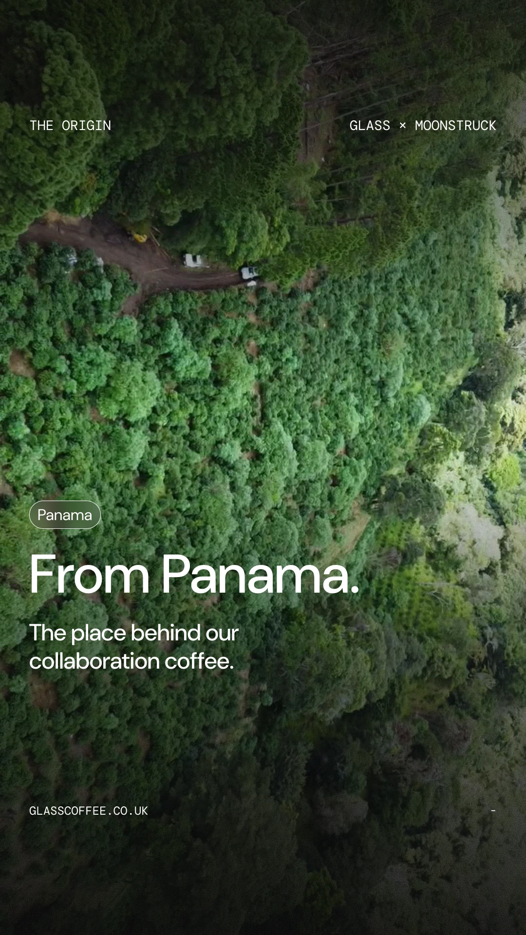
I also designed Glass’s Instagram content. These stories bring together the Roast Cards launch, the people making the coffee and its origin.

Glass Instagram story design introducing Roast Cards with a labelled roasting graphEnlarge image +
Introducing Roast Cards.
Glass Instagram story design: Coffee first. Conversation later., over a pour-over photographEnlarge image +
The people behind the coffee.
Glass Instagram story design: From Panama., over an aerial landscape photographEnlarge image +
Where the coffee comes from.

Large type, full-bleed photography and small labels keep the stories connected, even when the subject changes.

I worked with the Glass team on the experience and Shopify implementation, using Liquid, CSS and JavaScript.

Role, tools & collaborators

Responsibilities

  • Product and interaction design
  • Shopify theme development
  • Reusable product components
  • Instagram content design

Tools

  • Figma
  • Shopify Liquid
  • HTML, CSS and JavaScript

A closer look

Access granted.

You can now explore the private projects alongside the rest of my work. No extra steps between case studies.

Access stays in this tab until the session expires. You can lock it at any time using Private access.