Read time: 9 min
Skip
Pass, show me the UI
↓
Remember being quarantined and missing talking to random people? This was our attempt to solve that, while getting entertained in the meantime.
Remember being quarantined and missing talking to random people? This was our attempt to solve that, while getting entertained in the meantime.
Alex and I have been proudly working on many side projects over the years. The origin of this story starts no less than 10 years ago, when he built Chevismo.
We left this project years ago, but it was an online community where Alex built ideas he thought would be interesting to have online. When I met Alex in Uni, I started collaborating on many of these. But the homepage, besides being a bit of a sitemap to the rest of the site, was really just a dead simple chat.
Over time, this chat became more interesting than we expected. People kept coming back, so ways to give yourself a name and colour were added, and then this identity extended throughout the site. We started really getting to know some of the users that randomly appeared on the site and becoming regulars. We've even met some of these users in real life.
We are social beings. There is something extremely rewarding about having an engaging conversation with a stranger completely outside your social circle. But with quarantine, that wasn't really possible unless it were on the internet. We missed the Chevismo banter, but wanted to create something more generic that applied to anyone. The problem with internet chatting at the moment as we saw it was:
After some brainstorming, we were decided on a mission:
Make chatting to strangers on the internet feel as engaging as crossing paths with random people in real life.
Principles:
Solutions:
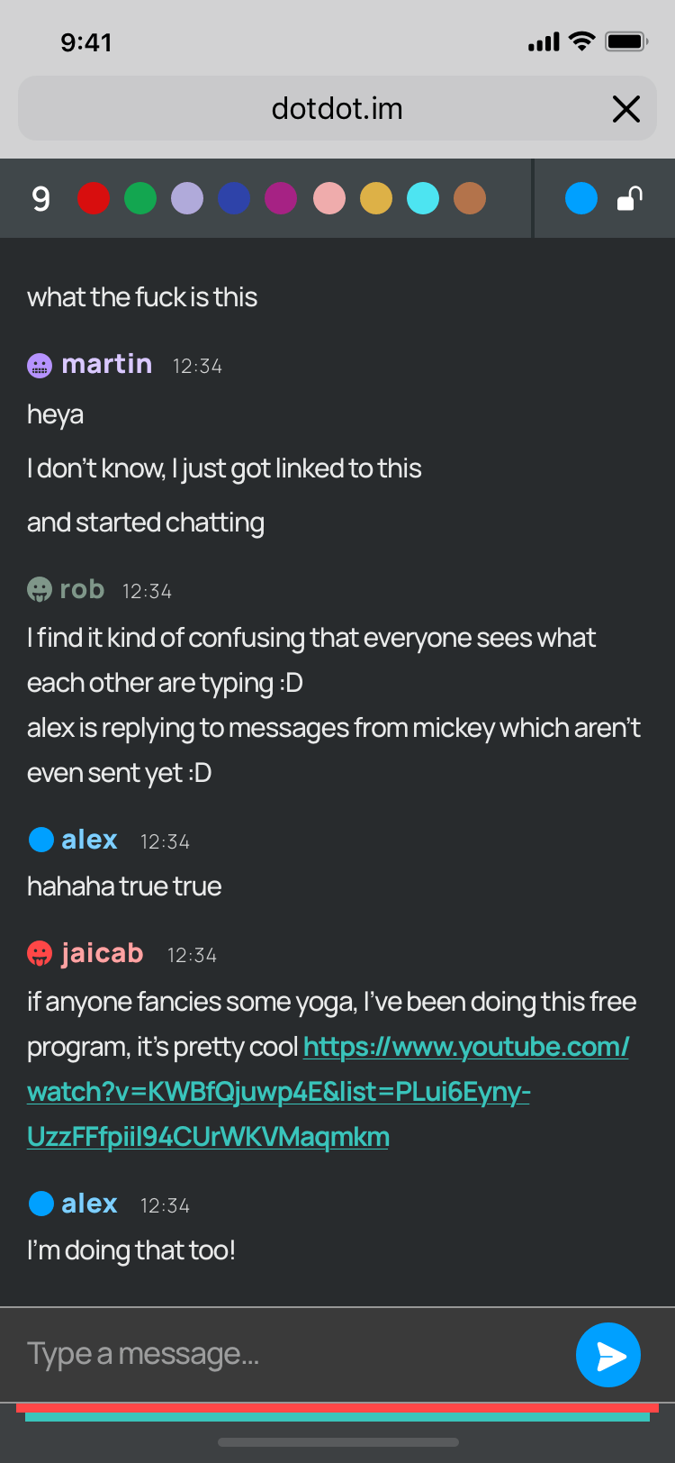
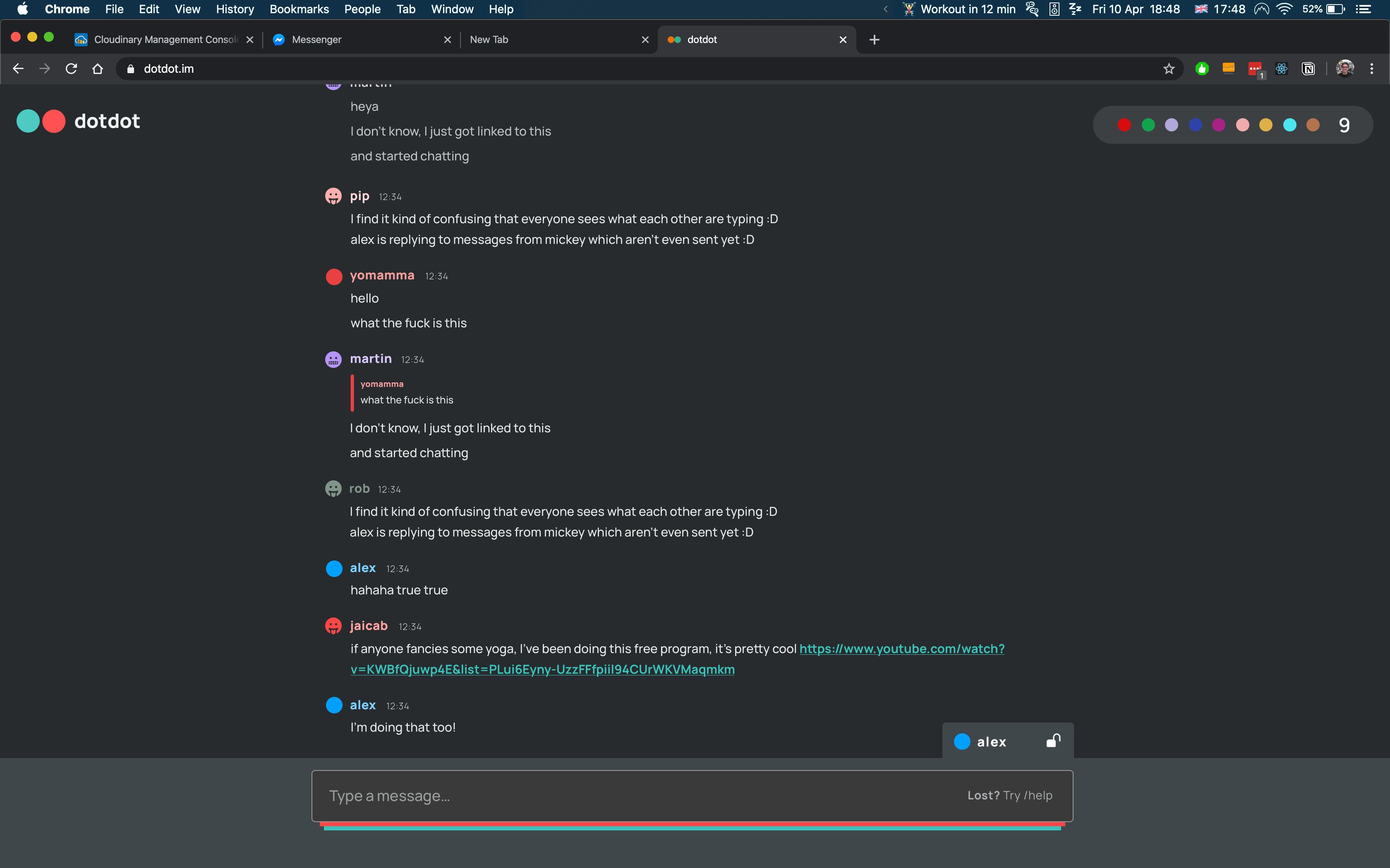
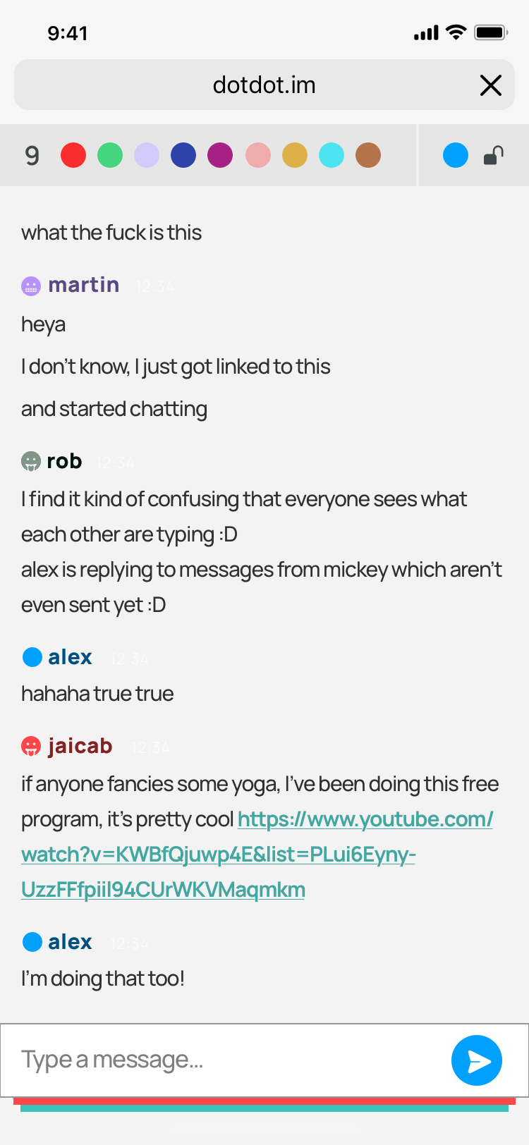
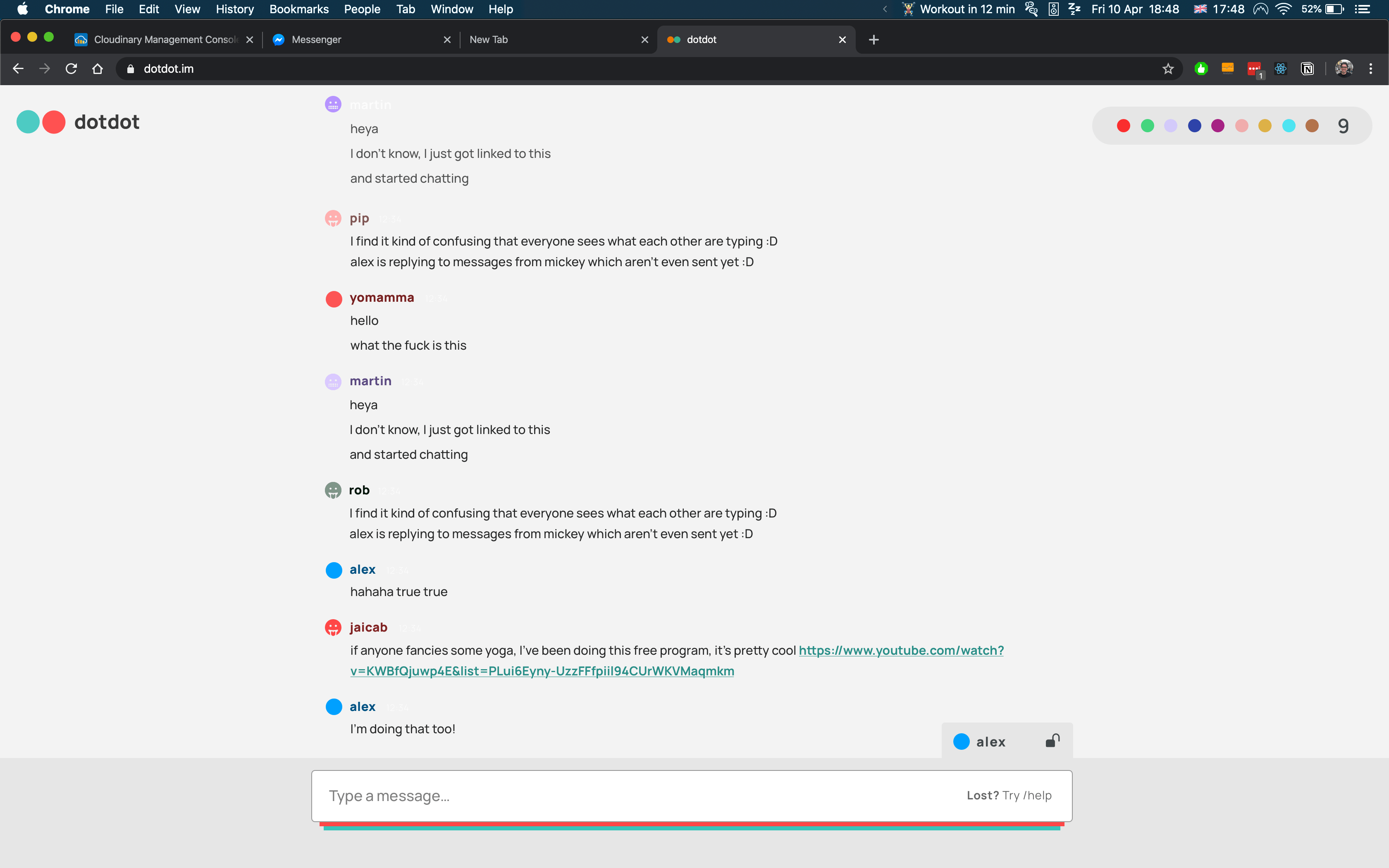
Since this project was heavily sided on backend, the developers started building a demo with basic chat elements and Bootstrap to then go from there. Then we found the happy accident.
Thanks to WebSockets technology, you can stream what an user is typing.
While this may seem like a bit of an uncanny valley to you at the moment, it resembles another UX paradigm shift you might have come across before: the first Snapchat you received and... gone!
Messages in Snapchat are ephemeral by design. While this was initially shocking to users, it is now a great success thanks to positioning themselves differently with this feature.
With so much to store mentally and digitally, users reported that they enjoy being able to have an interaction where they can be their true selves without worrying about the repercussions of their exchanges.
by Social Media Lab and and ReImagination Lab - Cornell University
At this point we had reached a solution that reached our goals while maintaining our values:
After a few brainstorming discussions, we came up with a few key user stories.
We separated these two into 2 screens:
I studied the UI elements and experience of the most well-known chat apps out there to make the experience relatable to users. It was interesting to see:
Based on this and after a few brainstorming sessions with Alex and Phil, I came up with initial high-end wireframes for the web-app.
While the developers were working on the app, I explored concepts for branding. The whole concept revolved around any 2 people interacting, so a core branding concept was representing each person with a dot. Besides that:
As the developers were building the better prototype, we quickly realised web-chat apps (aka not native) were tremendously hard to make a nice experience on mobile, so while massively important to us, we shifted to being a desktop first web-app. This meant leaving bubbles behind and embracing left-alignment, and so the follow-up UI reflected this.
For the type, I had originally gone with Rubik, a slightly quirky type, but ended up going with Manrope, a new variable font. It reads brilliantly at small sizes and makes for a super-fast load time.
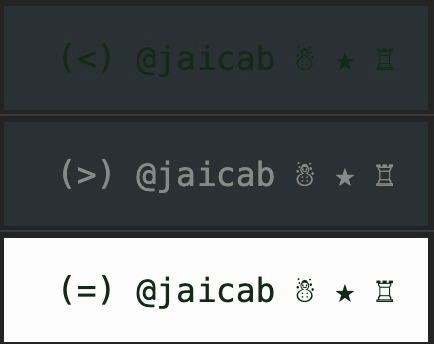
Users can be on the light or dark theme, depending on their device and the setting they're on. When they pick a colour, they won't take into consideration the contrast with the background, let alone the contrast with the theme they're not using.
So I developed a makeColorReadable function! Powered by pSBC.
/**
 * Takes a HEX string (with or without pound) and returns a colour visible in the theme background
 */
export const makeColorReadable = (color: string) => {
  const colorRgb = hex2Rgb(color) as rgbColor
  const isLightMode =
    window.matchMedia &&
    window.matchMedia('(prefers-color-scheme: light)').matches

  if (!colorRgb) return '#0000FF' // fail

  const offset = getThemeOffset(colorRgb, isLightMode)
  const readableColor = offset && pSBC(offset, color)

  return readableColor || color
}
This function measures the luminance a colour has and, if it's further than 50% in range (to preserve the originally picked colour where possible), swaps the colour with the one adapted for the theme.
No more worrying about contrast!
While not all of the design has been implemented, we soft-launched dotdot on reddit and the response was great! We validated how refreshing it is to see the messages being streamed directly. We learned that:
Plans for improvement: