Read time: 9 min
Skip
Pass, show me the UI
↓
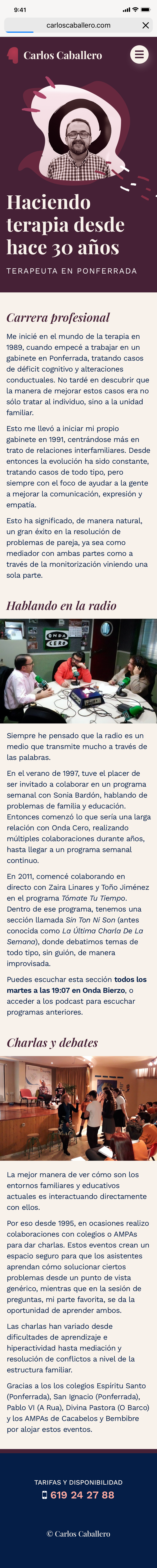
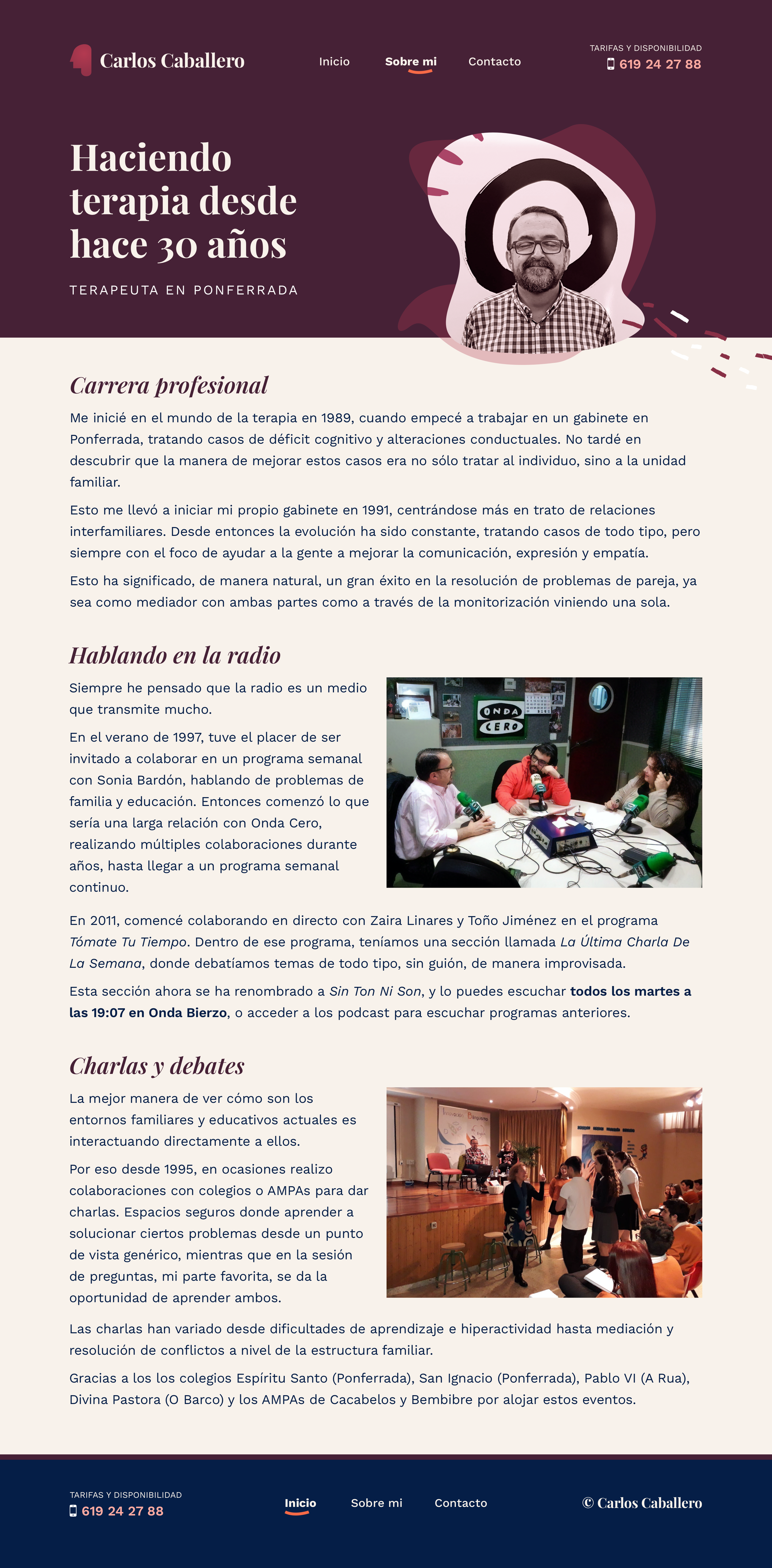
Carlos is a private therapist based in Spain specialized in couples therapy. He also happens to be my dad! It's quarantine project again.
Carlos is a private therapist based in Spain specialized in couples therapy. He also happens to be my dad! It's quarantine project again.
Carlos is a therapist based in a small city in northern Spain. He also happens to be my dad! When the COVID crisis hit, customers immediately cancelled all appointments. Although they were allowed to attend these due to being a healthy need, they wanted to obviously practice social distancing, as one should.
Since he would have loads of free time, I took this chance to properly redesign his site, until then no more than a mere mention on the internet, to actually boost his online presence and properly reflect his business persona.
Based on a business discovery interview and remote polling, I found a few interesting pains and constrains:
Based on requirements and user feedback, I was set on the product mission:
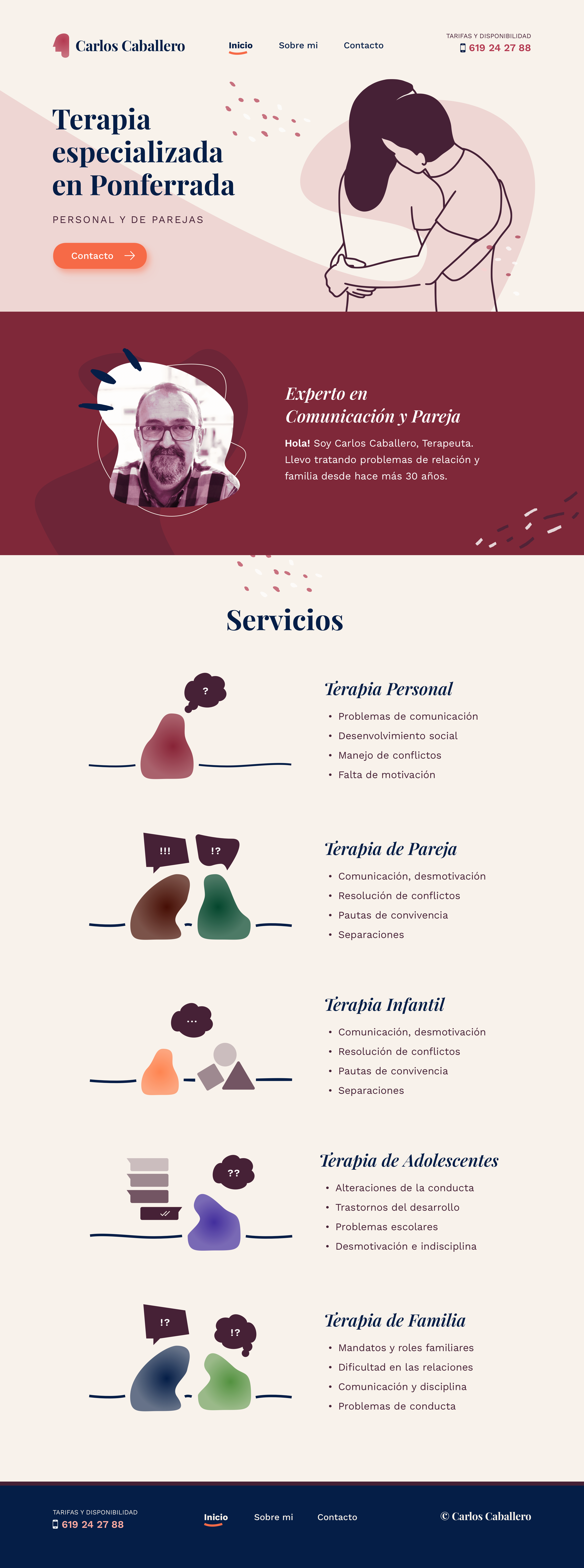
Make attending therapy look friendly, human and inclusive.
Principles:
Solutions:
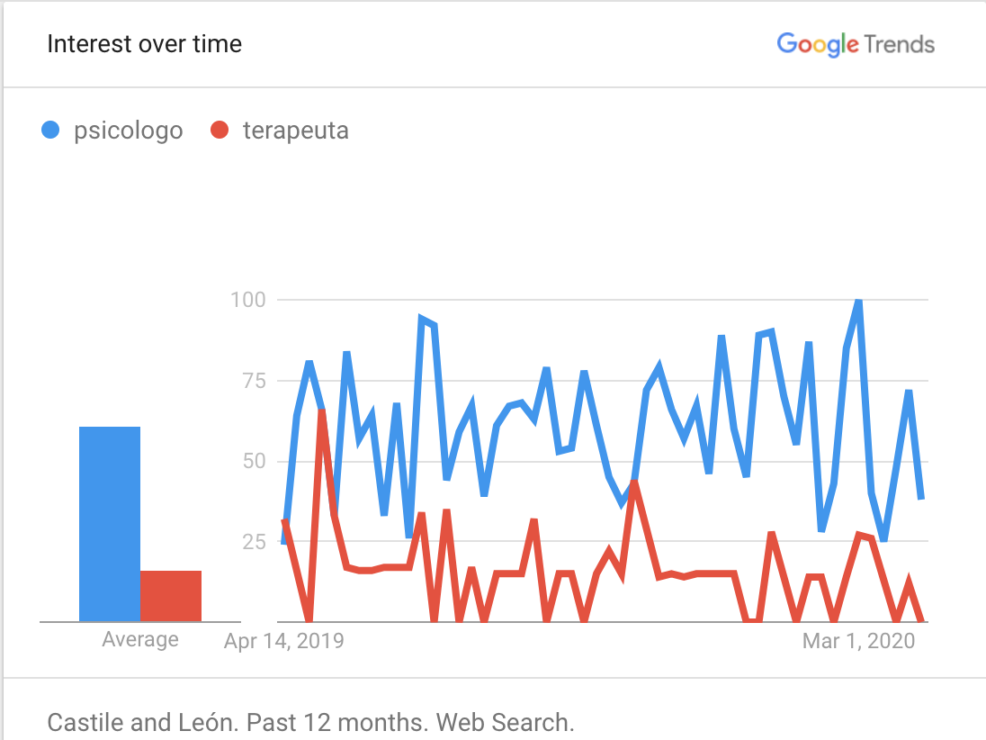
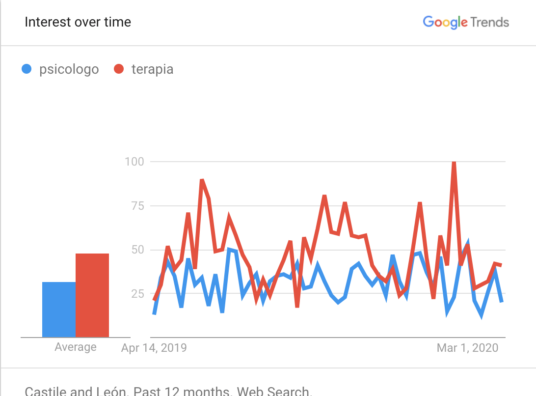
Competitor research showed all local competitors were extremely outdated and had a clinical feel. I interviewed the therapist and gathered data from Google Analytics, Google Trends and did some remote research to asses what the brand should represent.
| Therapy type | % of total | Women / Men | Age groups |
|---|---|---|---|
| Couples | 60% | 70 / 30 | 20-30 / 40-45 |
| Teenagers | 20% | 50 / 50 | Up to 24 |
| Others | 20% | 50 / 50 | Mixed |
The main source of revenue is by far couples therapy, but there was a growing interest on proactive teenargers that reached out themselves. Teenagers historically came by recommendation of their parents, now they had the initiative and asked their parents for this service.
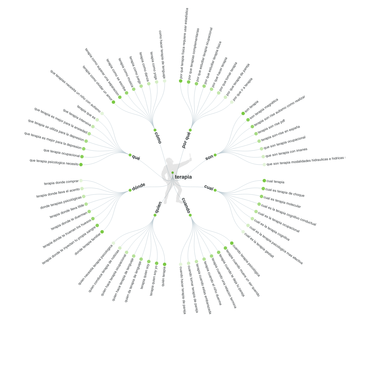
Over the last year, the rising topics were:
From the interview, I gathered relevant information for content creation and communicating experience.
| Device category | Users |
|---|---|
| mobile | 68,08 % |
| desktop | 9,59 % |
| tablet | 2,33 % |
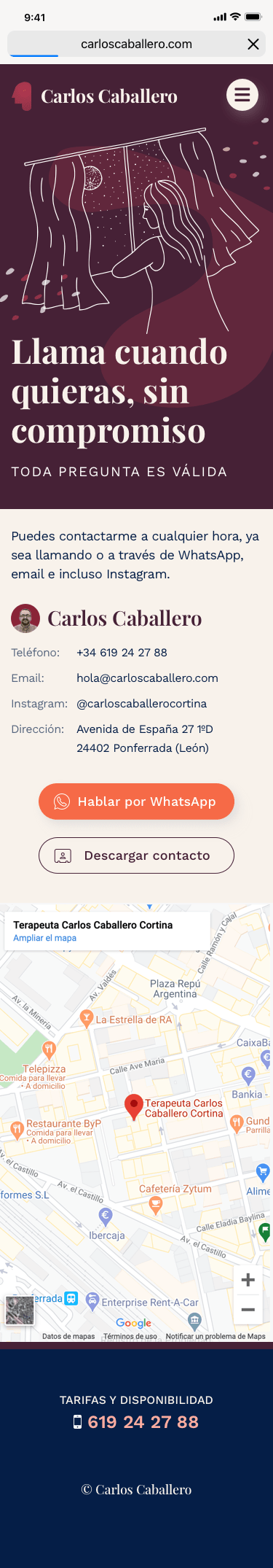
68% of traffic came from mobile, so mobile experience was crucial. The interview also revealed clients added the contact details to their phones instead of asking for a card, and an uprise in people contacting via WhatsApp as a first contact validated this rise in mobile engagement.
In terms if core keywords, I determined "therapy" was a much friendlier, sought after service than "psychology" or "psychologist". So it was determined that was gonna be a core brand directive.
The findings from the research indicated we needed a lot of content created to communicate what therapy is. Since the client had limited resources, I proposed to set a milestone on communicating at least his persona and services.
Key user stories
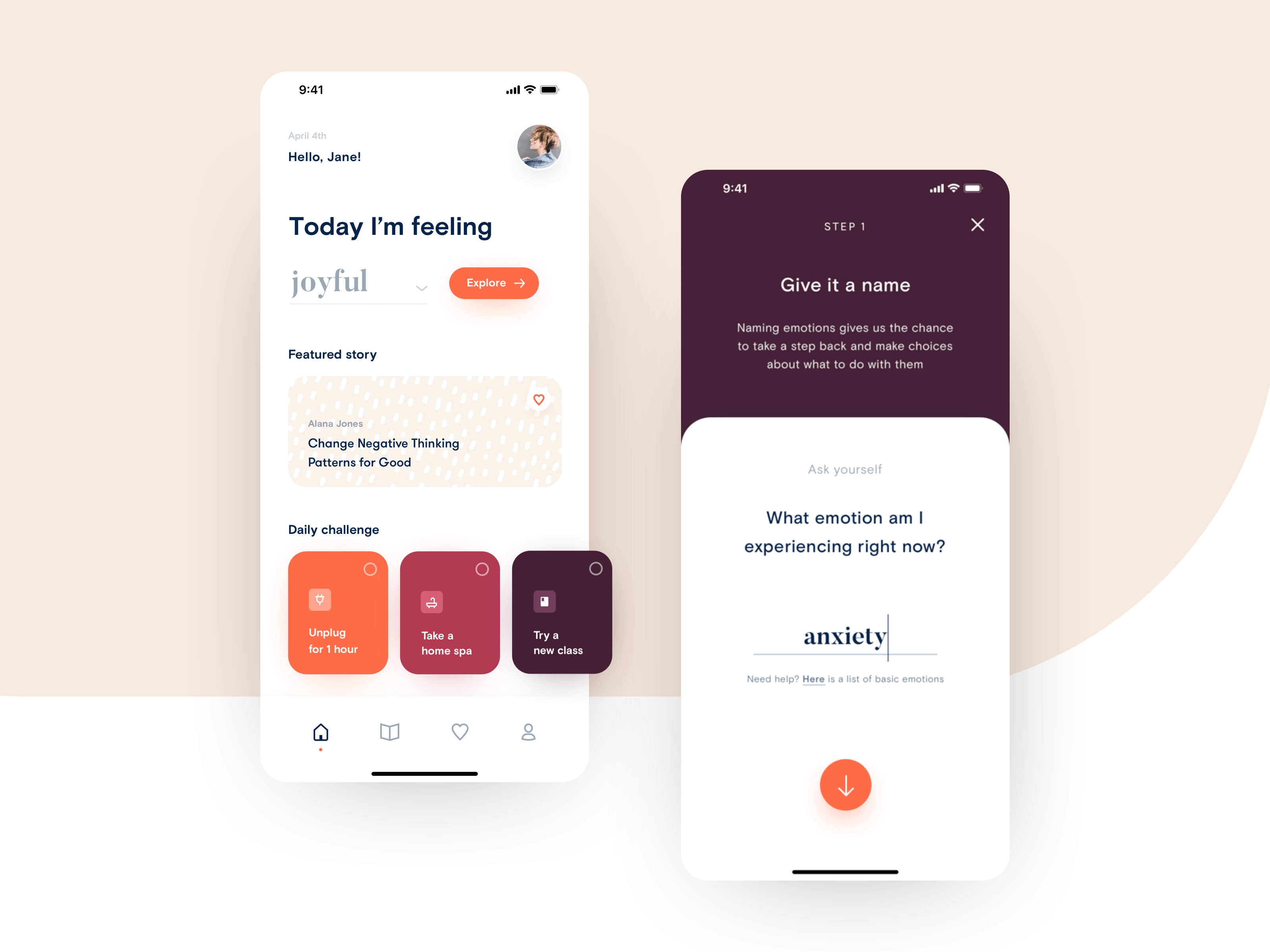
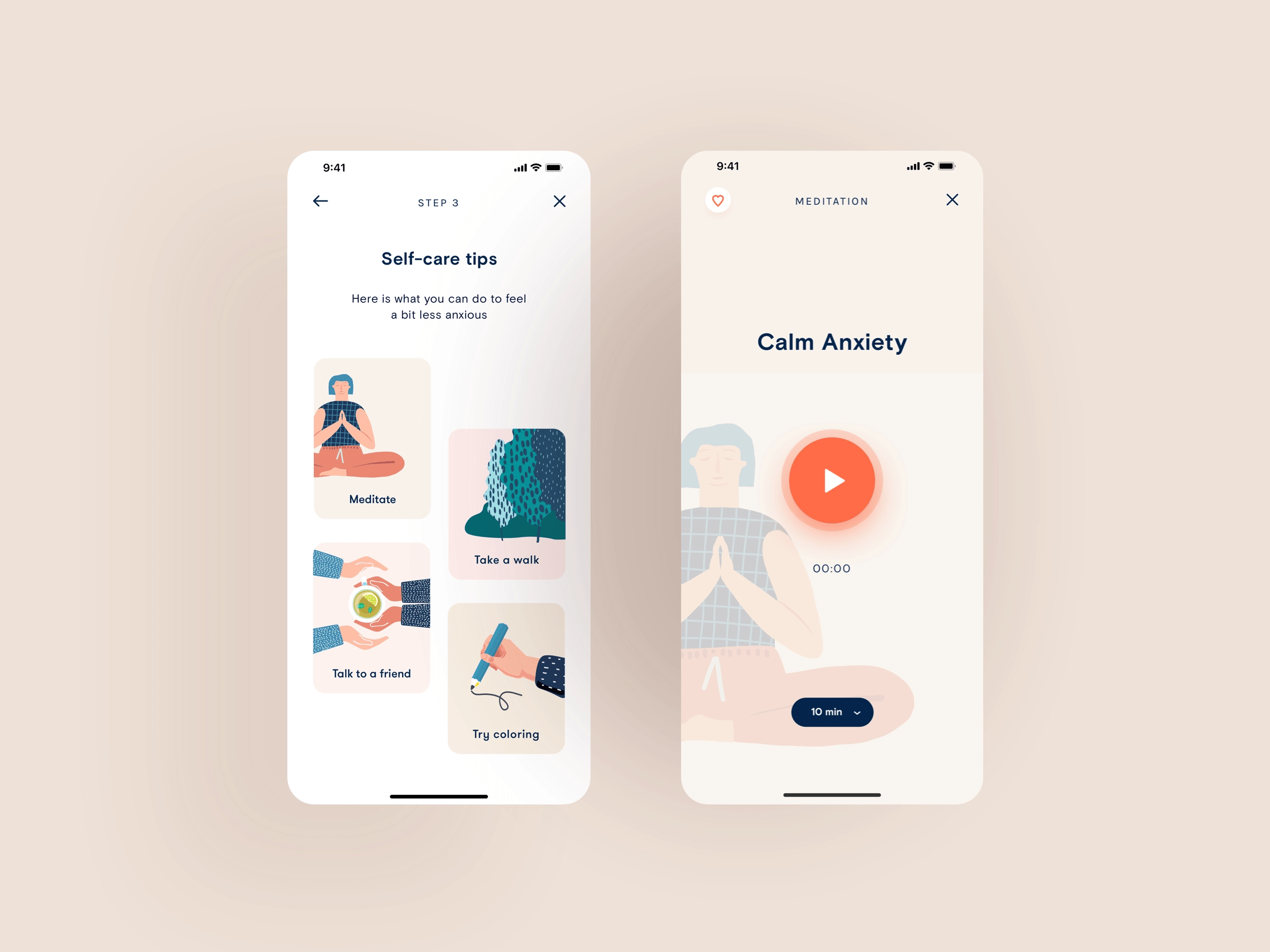
I put this together as three screens:
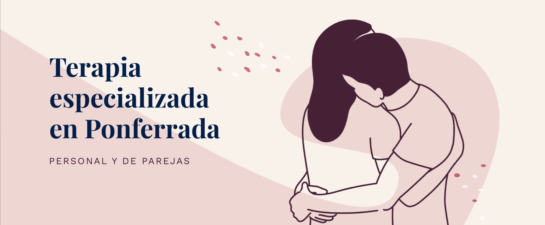
Given the target audience was mainly mobile, female and relatively young, I put together a moodboard accordingly. I took inspiration on mobile mindfulness, self-care apps and modern illustration, with organic shapes and tons of breathing space.
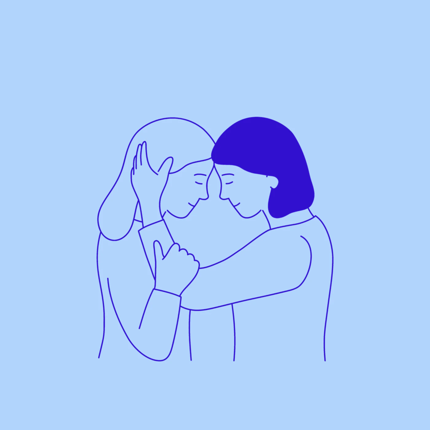
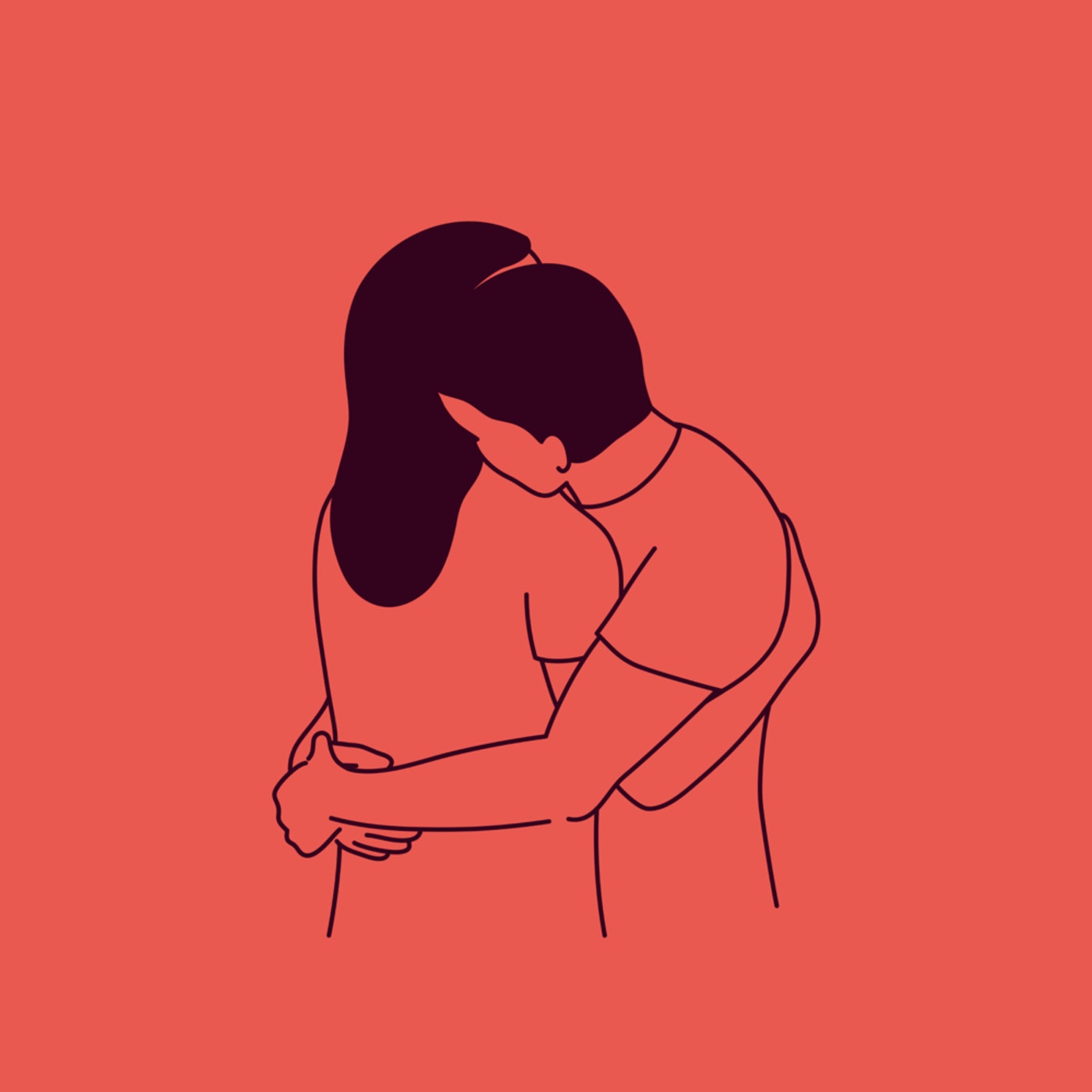
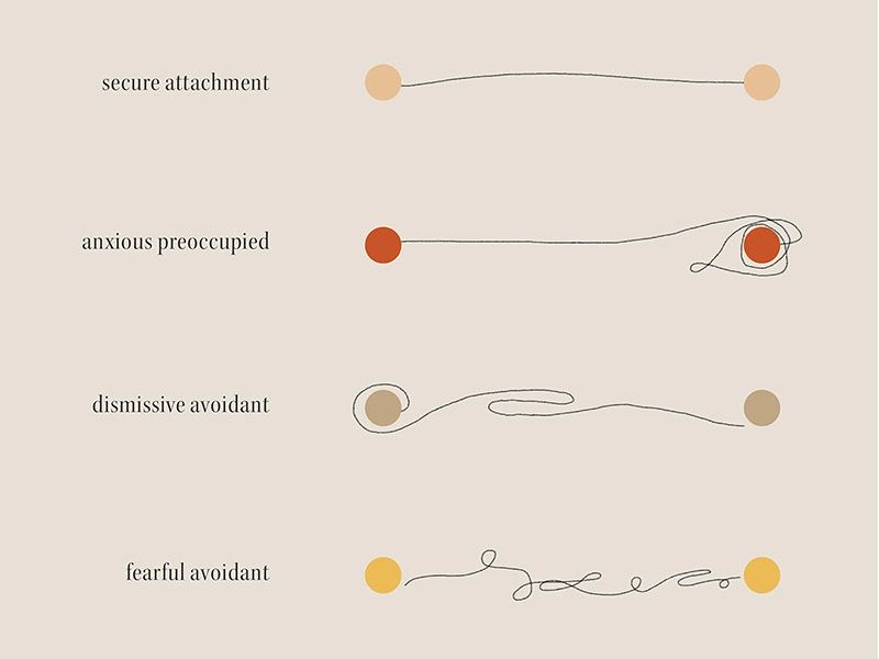
I was deeply inspired by Taylor Roy's Attachment Styles collection. While bluntly simple, it felt really engaging, modern and organic. Very on-brand with what I was looking for.
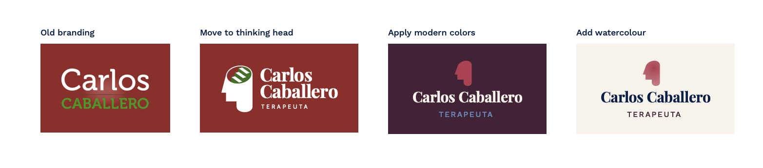
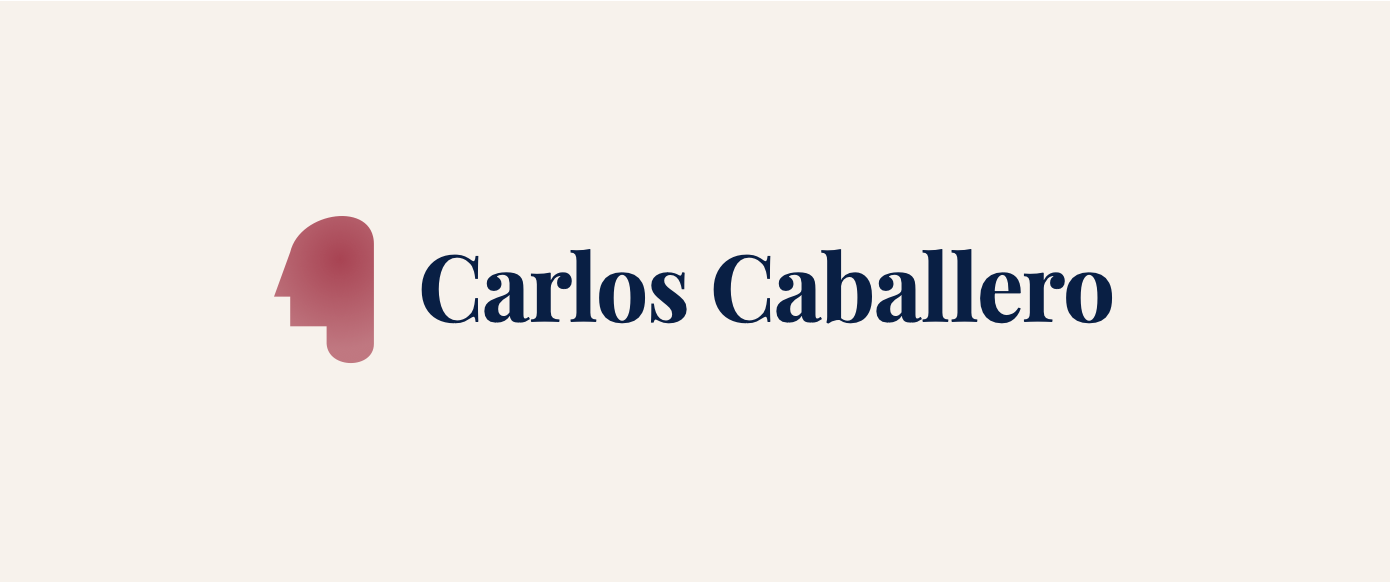
Brand keywords: friendly, approachable, organic, professional, individual. I started from the old brand and played with the idea of a simple "thinking head" made of a watercolour drop, while the type had to be somewhat mature and professional, so I went with a serif font: Playfair Display. For the content I went with Work Sans, a classic sans-serif type, helping with contrast and readability on mobile.
Big props to Kika Fuenzalida for her stunning illustrations.
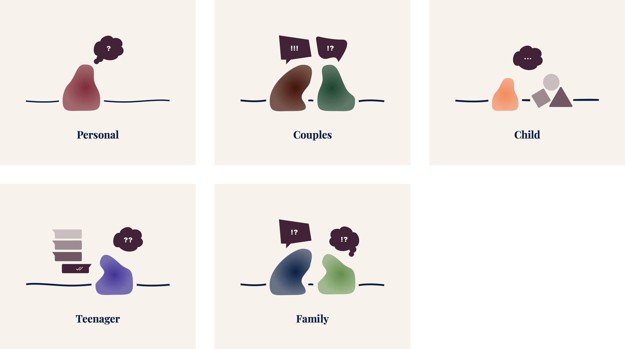
We were set on 5 types of therapy: personal, couples, child, teens and families.
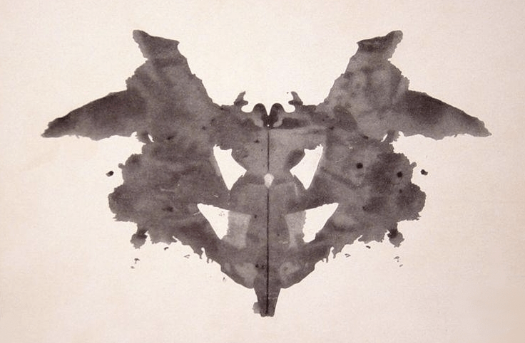
As I needed to come up with an inclusive way of representing all without locking them to an age, sex, gender, sexual orientation, race or background and although a bit cliché, a classic therapist exercise came to mind: The Inkblot Test, made by Hermann Rorschach in 1921.
The whole argument here is, briefly explained is asking "what do you see here" and letting the customer dive into the crevices of the drawing while their mind drifts away, speaking more than they initially might have if asked directly about a topic.
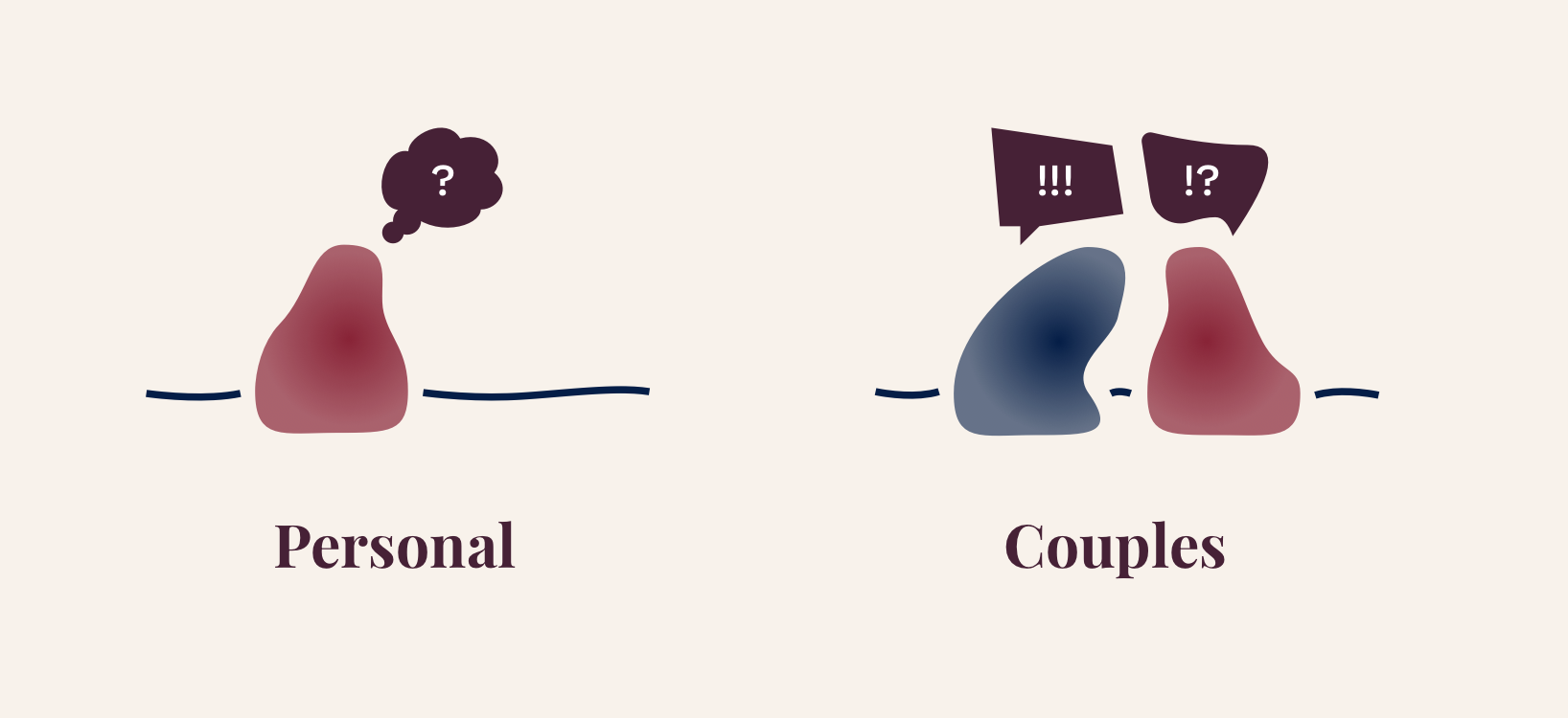
The idea of letting the user see fill in most of the picture for themselves was exactly what I was thriving for, so I designed a blob for each therapy type.
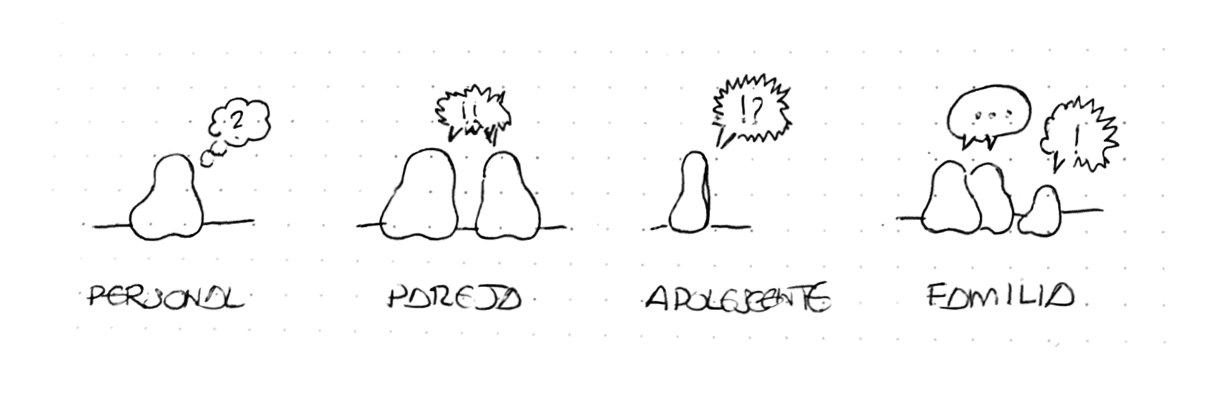
Initial sketch:
First solid test.
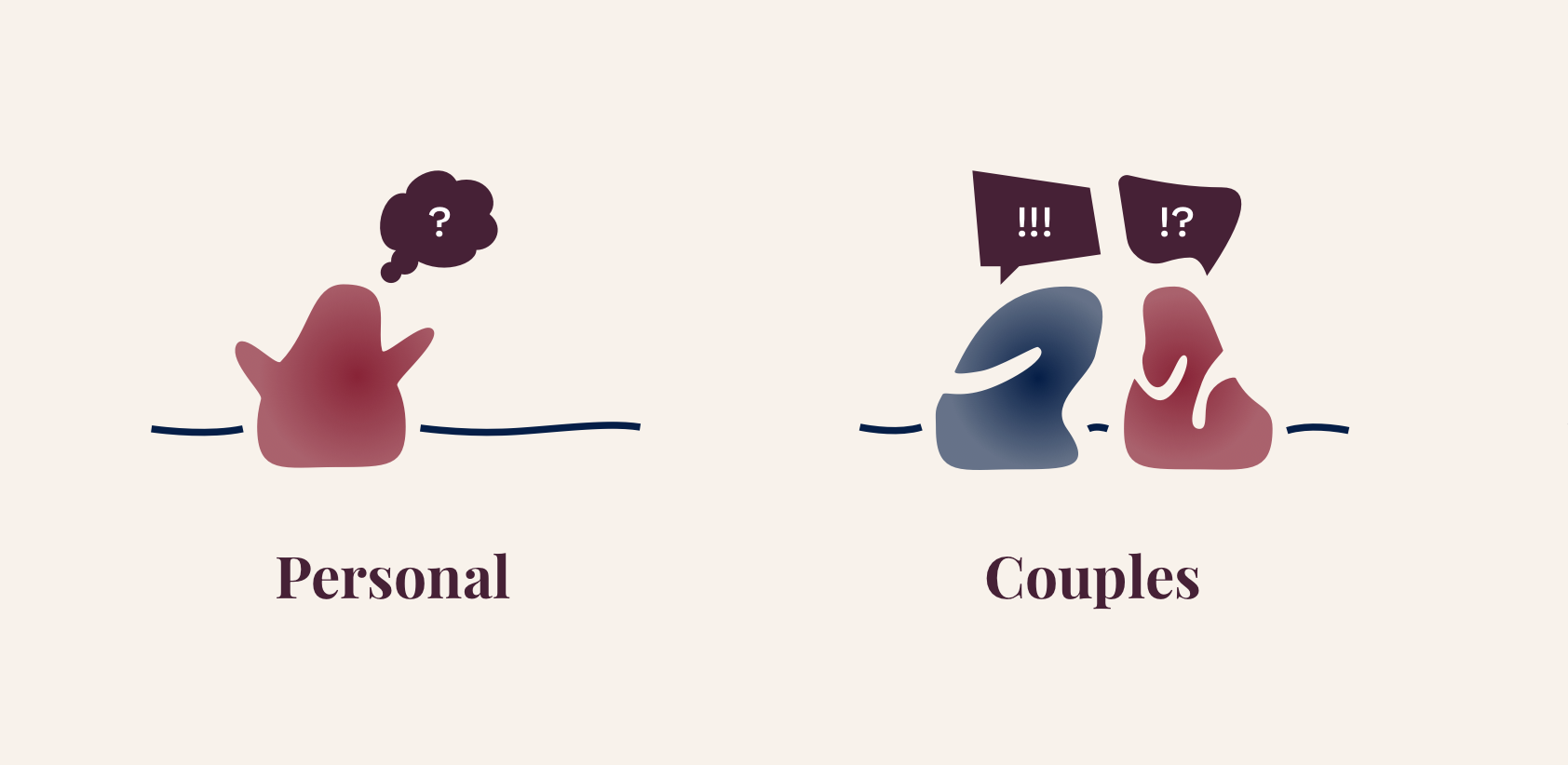
I tried a few variations too! Do you see arms or mouths?
As this was such an open topic, I tested these with everyone I knew. Interestingly, people seemed to connect them as the same if they were coloured the same colour for different situations. They tried to follow a story, like if it were a comic.
So I had to make each colour unique, even at the cost of being slightly off-brand. Arms were a no-go too, as some people mistook them as other body parts or added expression. This was the end result:
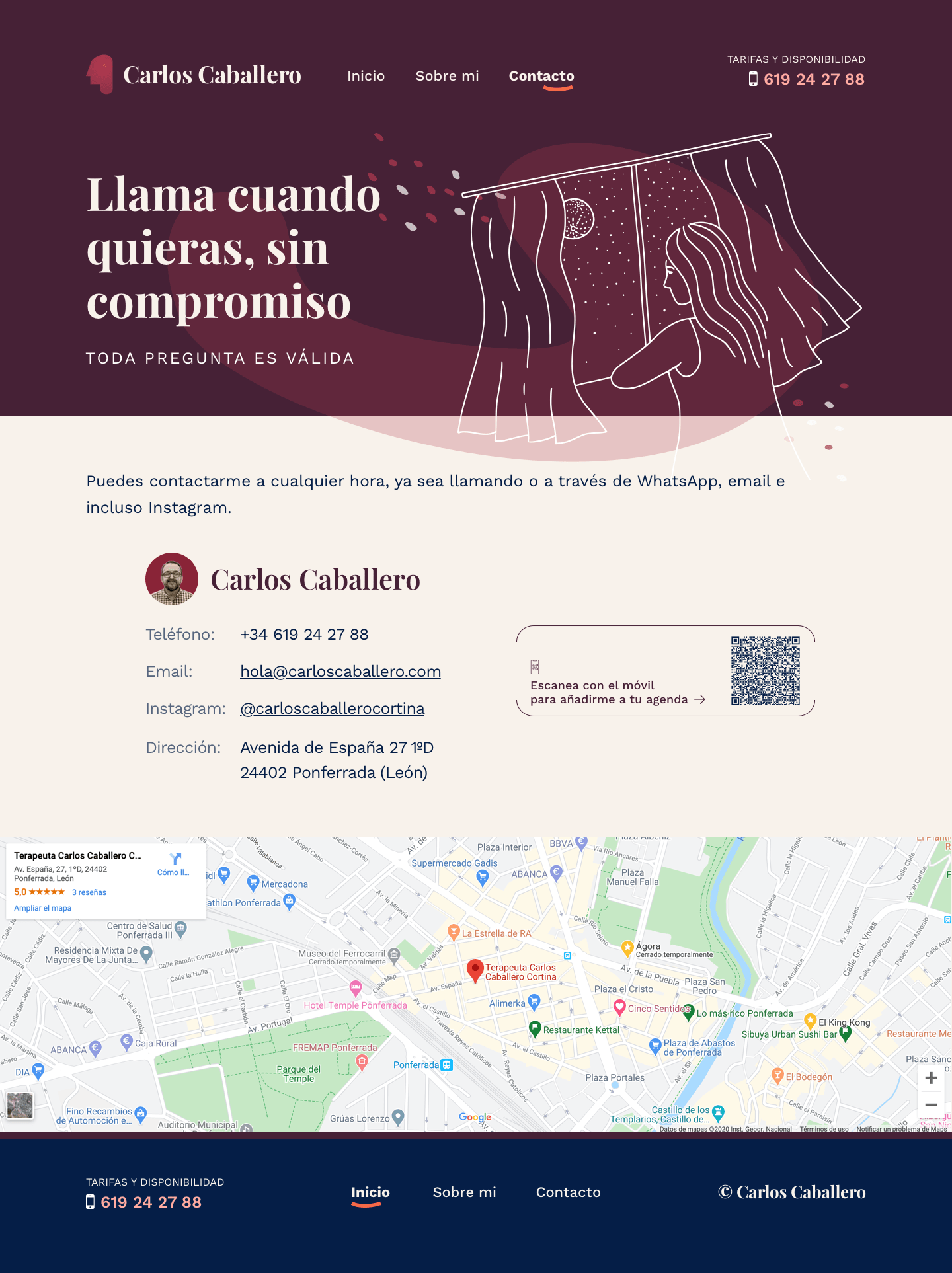
On the contact page, users can WhatsApp directly through a CTA thanks to WhatsApp Click To Chat links, or add all the contact details directly to their device downloading the vCard.
As a static site, I built this using 11ty (Eleventy) with Markdown content and the Nunjucks templates. For the styling, I built a Sass component library with an utility-first approach, making everything extremely modular. As with all my builds, everything was done mobile-first and with responsive breakpoints per pattern, making the entire experience flow beautifully across devices.
Illustrations are served as SVG for pixel-perfect rendering. The rest of the imagery is hosted and optimised through Cloudinary, and the site is served via GitHub Pages through Cloudflare for caching and faster delivery.
During the build of this project, I realised I could optimise a few things:
Plans for improvement: